Newsletters for mobile — 5 tips
When a recipient opens a newsletter sent through our platform, we record the device it happened on — Windows, Mac, iPhone, iPad, Android and so on — and the numbers are part of the newsletter’s statistics.
We help customers read those numbers regularly, and the trend is unmistakable: mobile devices are taking over. The same is true internationally, and it is expected that more than 70 per cent of newsletter readers will soon read on a phone first.
That matters if you send newsletters. A mobile-optimised template puts you in good shape, but it takes a little more to make mobile readers happy. Here are five things that help.
1. Write for the device
This is by far the most important one.
People reading on a phone typically have less time for your content than people reading at a desk. If many of your readers are on mobile, the content has to change to match.
Keep their time in mind as you build it. Short and to the point, cut to the bone, with good headings and obvious links.
Rather than including the full story, link to a page where it can be read in full. That makes it easy for the recipient to scroll through, find what interests them, and read on.
Consider writing shorter newsletters and sending more often. Mobile readers spend less time in total on your newsletter, and when the content is short they are more likely to engage with it and click.
In short: brief, precise, use headings, link to the full story.
2. Use images deliberately
Images take up a lot of room on a phone. Where a desktop layout can put text on the left and an image on the right, a phone has to stack everything into one column — so the image comes first and pushes the content down.
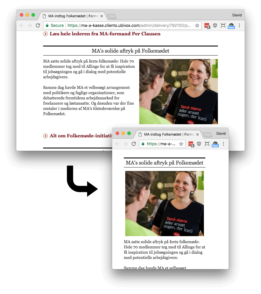
That is a reason to be careful with them. Too many images move your readers’ attention away from the content and raise the chance that they leave again without reading or clicking.
It does not mean you should leave images out. They illustrate points and support a story, and they have their place. Just ask what a given image is for before you put it in.
3. Buttons are your friend
When you link from a mobile-optimised newsletter, it helps if the link is not buried in the middle of a paragraph but appears as a button the reader can hit with a thumb.
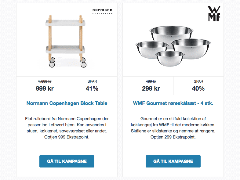
For some, that means limiting the number of links, since you can no longer link from inside the text. Our experience is that the restriction sharpens the message — and that it ends up producing more clicks, because the recipient is presented with fewer choices.
4. Use the preheader to extend the subject line
On a phone, the inbox usually shows a snippet of the first part of the content below the subject. The preheader is an element your template can include that lets you write a line shown before anything else in the newsletter.
That gives you a rare opportunity to put two messages in front of the reader — one in the subject line and one in the preheader.
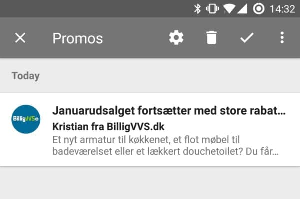
In the example above I am offered both a general January sale and, specifically, bathroom fittings and furniture. If the first message does not land, the second one might.
5. Optimise the whole way through
If your website is not built for a phone, a mobile-optimised newsletter can make the experience worse rather than better. A newsletter that works well on mobile sets an expectation, and the reader who clicks your link is disappointed when the page does not meet it.
So if you send mobile-optimised newsletters today, getting the website to match deserves a place on the list.